How can you design a flyer that effectively communicates pricing information?
In a saturated advertising market, designing a flyer that effectively communicates pricing information is essential to capture attention and drive customer action. Pricing can be a make-or-break factor, and a well-structured flyer has the power to inform, persuade, and convert viewers into paying customers. To achieve this, the flyer must be visually appealing, easy to understand, and strategically laid out to highlight prices alongside value propositions.
Understanding the Purpose of the Flyer
The first step in designing an effective pricing flyer is defining its objective. Is the goal to promote a new service, announce a sale, or introduce package deals? Once the purpose is clear, the content and layout can be tailored accordingly. Pricing should support the main objective, not overwhelm it. Flyers that are cluttered with too much information lose effectiveness. Focus and clarity are key.
Visual Hierarchy and Layout
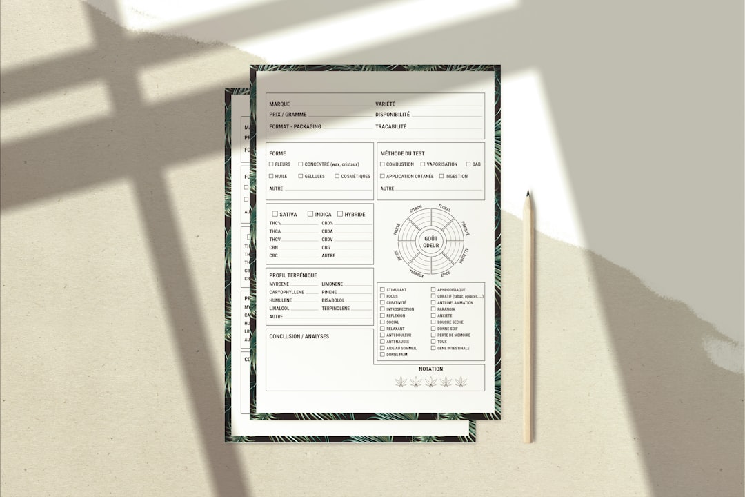
Creating a clear visual hierarchy is essential when presenting pricing information. A well-structured layout ensures that the most critical information is seen first. To do this effectively, designers should:
- Use larger, bold fonts for pricing to make it stand out.
- Group related services or products together in easily digestible sections.
- Balance white space and graphical elements to avoid visual fatigue.
For example, consider a segmented layout with three pricing tiers: Basic, Standard, and Premium. Each section can contain the price, features, and a call-to-action button. Color coding these tiers helps customers compare options at a glance.

Typography and Color
Typography plays a key role in drawing attention to prices. Using different font weights and sizes can create contrast and direct the reader’s eye to vital information. Choose legible fonts and avoid using too many styles—a clean look enhances professionalism and readability.
Color, meanwhile, can subtly guide viewer perception. Bright colors like red or orange can highlight discounts or special promotions, while calming tones like blue or green can promote trustworthiness. Designers should stick to a complementary color palette that aligns with the brand’s identity.
Incorporating Value Propositions
Price alone doesn’t sell—value does. Enhancing the flyer with clear value propositions helps customers justify the cost. For instance, instead of listing a “Website Design Package – $399,” say “Professional Website Design – Only $399 for a Full Responsive Site and Free Consultation.” This adds context and makes the price feel worthwhile.
Bullet points can be useful here to list features and benefits succinctly:
- Fully responsive design
- SEO optimization
- 2 weeks of post-launch support
These extras help customers perceive they are getting more for their money.

Using Visual Aids to Reinforce Pricing
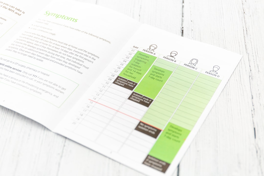
Icons, badges, and graphs can reinforce pricing structure and drive attention. “Best Value” or “Most Popular” tags on featured pricing tiers encourage users to gravitate toward those packages. Visual comparison tables also work well when offering multiple service or product levels, helping users make informed decisions.
Call-to-Action and Contact Info
Each flyer should end with a strong, visible call-to-action (CTA) that guides the reader on what to do next—whether that’s visiting a website, calling for a quote, or visiting the store. Place pricing near contact information for added convenience. The CTA should be urgent and inviting, such as:
“Call Today for Limited-Time Pricing!”
Testing and Feedback
Before printing or distributing the flyer digitally, it’s helpful to test it with a small audience. Ask for feedback about clarity, readability, and overall impression. A fresh set of eyes can identify areas needing improvement, especially concerning perceived value and pricing clarity.
FAQ
- Q: How much information should be included on a pricing flyer?
A: Include just enough to communicate the value of your offering and essential pricing. Avoid clutter and focus on what matters to the target audience. - Q: Should I include discount percentages or exact dollar savings?
A: Both can be effective, but use the one that creates a stronger psychological impact. For higher-priced items, a dollar discount may seem more attractive. - Q: Do flyers work better with graphics or plain text for pricing?
A: A combination usually works best. Graphics like price badges and icons catch attention, while clean text offers clarity. Balance is key. - Q: Is it helpful to include a QR code on pricing flyers?
A: Yes, QR codes can lead viewers to detailed pricing pages or promotions online, improving engagement and tracking results. - Q: How do I handle multiple currencies or price variations?
A: Use clear labels, flag icons, or separate sections for each market. Alternatively, direct users online to select their region for accurate pricing.
