

Mastering Color Correction in Photoshop: Pink and Magenta Tones
Color correction in Photoshop is like magical makeup for your photos. It helps bring balance to images, making them look more natural or more dramatic—whatever you prefer! But when it comes to controlling pink and magenta tones, things can get tricky fast. Don’t worry, though. We’re about to turn that confusion into confidence.
Contents
- 1 Why Pink and Magenta?
- 2 Start with the Right Setup
- 3 Step One: Identify the Problem Areas
- 4 Step Two: Open the HSL/Grayscale Panel
- 5 Step Three: Use Selective Color
- 6 Step Four: Use the Camera Raw Filter for Full Control
- 7 Bonus Tip: Use Curves for Spot Fixing
- 8 Final Touches Matter
- 9 Practice Makes Perfect
Why Pink and Magenta?
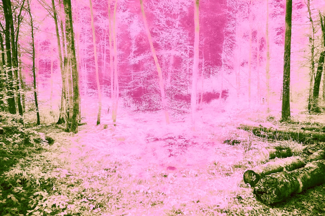
Pink and magenta tones are everywhere. Think sunsets, flowers, fashion shots, and even skin tones. But too much magenta can make skin look unreal. Too little can make an image feel flat, lifeless. Mastering this range gives your photos that *chef’s kiss* quality.
Let’s break it down into manageable steps with simple tools and tips.
Start with the Right Setup
- Always work on a duplicate layer. This keeps your original safe.
- Check your monitor calibration. If your screen isn’t accurate, your edits won’t be either.
- Use a color-neutral background in Photoshop. Avoid dark themes that can throw off your perception.
Step One: Identify the Problem Areas
Find where those pink and magenta tones are misbehaving. Use the Eyedropper Tool and hover over different areas of your image. Look at the Info Panel. Are the red values too far above the green and blue? That’s a clue!
And don’t forget, your eyes are your best guide too. Trust them!
Step Two: Open the HSL/Grayscale Panel
Go to Image > Adjustments > Hue/Saturation. This is your command center for color magic.
In the drop-down, select Reds or Magentas. Now move the sliders to control hue, saturation, and lightness just in those tones.
- Hue: Changes the base color. Shift magenta to more red or more purple.
- Saturation: Reduces that fake, glowing pink. Very useful for toning down neon colors.
- Lightness: Makes those tones brighter or darker. Can be great for subtle touch-ups.
Tip: Try turning magentas all the way down to see where they are affecting the image. Then bring them up just enough.
Step Three: Use Selective Color
This tool is tucked under Image > Adjustments > Selective Color. Don’t ignore it—it’s powerful!
Choose “Magentas” from the drop-down menu. You’ll see sliders for Cyan, Magenta, Yellow, and Black. Adjusting these can help shift the pink tones without changing the whole image.
- Increase Cyan: This mutes the pink tones.
- Reduce Magenta: Tones things down even more.
- Increase Yellow: Warms the magentas—great for skin tones!
Pro Tip: For portraits, small changes make a big difference. Don’t go overboard.
Step Four: Use the Camera Raw Filter for Full Control
Here’s where things get exciting. Convert your layer to a Smart Object. Then go to Filter > Camera Raw Filter.
Navigate to the Color Mixer tab. You’ll find individual sliders for hue, saturation, and luminance.
Tweak Magentas and Pinks here for precise balance. Sometimes, reducing luminance for pinks gives images a moody, editorial vibe. You’ll see.
Bonus Tip: Use Curves for Spot Fixing
Want pinpoint control? Go to Image > Adjustments > Curves. Here, you can adjust the RGB channels directly.
Choose the Red or Blue channel and make subtle curve changes to only the areas that need it. It’s perfect for overriding stubborn magenta shades that don’t respond to blanket edits.
Warning: It’s easy to overdo curves. Zoom in and keep checking against the original.
Final Touches Matter
Once you’ve corrected the tones, go over your image again. Zoom in and look at shadows, highlights, and midtones. Sometimes pink hides in unexpected places, like reflections or edges.
Try adding a Vibrance adjustment layer to even things out at the end. Unlike Saturation, it targets only the duller colors, which helps keep pinks natural.
Practice Makes Perfect
Each image is different. The lighting, colors, and subject all matter. Play around. Make mistakes. Click “undo.” That’s how you learn!
And remember—color correction is part science, part art. Don’t stress the details too much. If it looks good to you, it probably looks good to others too.
Happy editing, and may your magentas always stay marvelous!